| Location in Store | G1H34A |
|---|---|
| Article No. | 4501271-104 |
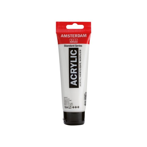
The Amsterdam Standard Series is an acrylic paint for artists that is of the highest studio quality that comes in 70 hues as well as 6 metallic colours and 4 fluorescent reflex colours. All hues are lightfast to a very high level (minimum of 25 years), some having the highest possible lightfastness (minimum of 100 years under museum conditions). All the fluorescent colours, which are by their nature not lightfast, are the exceptions. The pure acrylic resin binding agent provides an unusually high degree of aging-resistance. This practically odour-free acrylic paint is can be applied to all grease-free surfaces that are absorbent to at least some degree and is also suitable for wall painting (even on freshly plastered walls) because it is resistant to alkalis. None of the cadmium colours are compatible with outdoor use. It is possible to paint directly from the tube by employing the applicable dosing nozzle that can be purchased separately. These nozzles fit onto all the 120 ml tubes and can be closed. By using the various Royal Talens auxilliaries for acrylic painting, you can modify the degree of glossiness, the viscosity, and the structure of these acrylic paints. When properly thinned the Amsterdam acrylic paints can be applied with an airbrush (maximum particle size is 25 microns).
The set of 5 primary colours includes titanium white (105), primary yellow (275), primary magenta (369), primary cyan (572) and oxide black (735).
The set of five non-primary colours is supplemental to the primary set and includes titanium white (105), azo yellow lemon (268), naphthol red medium (396), ultramarine (504) and oxide black (735).
The principles of colour mixing can be learned with the three primary colours of yellow, magenta, and cyan because with them practically all hues you might want can theoretically be created (when used in conjunction with black and white). With just the black and white, many shades of grey (50?) can also be created. The limitations of this so-called Three-Colour-Mixing System lie in the fact that, especially in the case of orange and violet hues produced by mixing the primary colours, the results will be somewhat imprecise and uncertain. This follows from the fact that the primary colours themselves have a a kind of tinge that leans in the direction of warm or cold colour types: primary yellow and magenta have traces of cool blue, cyan is a yellow with blue traces, and thus is a warmer hue. A violet created by mixing cyan and magenta contains, in addition to blue and red, also traces of yellow that is the cause of the imprecision of the violet hue. In order to create saturated hues in all your mixed colours it is advisable to supplement the primary colours with a cold or warm hue, as the case requires. The supplementary set with the so-called "non-primary" colours thus contains the missing warm or cold hue for each respective case.
If you want to learn more about colours there is a brochure that can be downloaded at https://www.royaltalens.com/ that provides a vivid depiction of colour theory.
Free standard delivery within Germany and free collection from Modulor in Berlin for orders over 89 €.
5,95 € shipping costs, if order value is less than 89 € (DE)
2,95 € for pick-up at the store in Berlin, if order value is less than 89 €
Express and forwarding shipping
From 19 € express surcharge you will receive your order particularly quickly with standard shipping within Germany.
From 69€ is the cost of shipping within Germany. You can recognize articles with forwarding shipping in the store by the truck symbol .
Especially for Berlin
From 34.90 € courier shipping for standard and forwarding goods.
- Free returns for standard shipping within Germany
- Extended, voluntary return policy of 30 days for complete, undamaged goods in their original packaging
- You are responsible for the cost of returns for forwarding goods and returns from a country outside Germany
Excluded from returns
Excluded from returns are sections of rolled goods, cut-to-size pieces and other goods made especially for you, as well as used goods, newspapers, magazines and periodicals, Modulor vouchers and items that we do not carry in our range but have ordered at your request.
Good to know: The furniture variants in our configurators that can be delivered quickly are not cut to size, but standard formats that can be returned.
